Colour Effect
The effect of colour must always be seen in context – and is often different from person to person. This is due to the experiences we have had with different colours, our history of perception and our culture. Blue, for example, may be soothing or stimulating, whereas red may either boost or inhibit creativity.
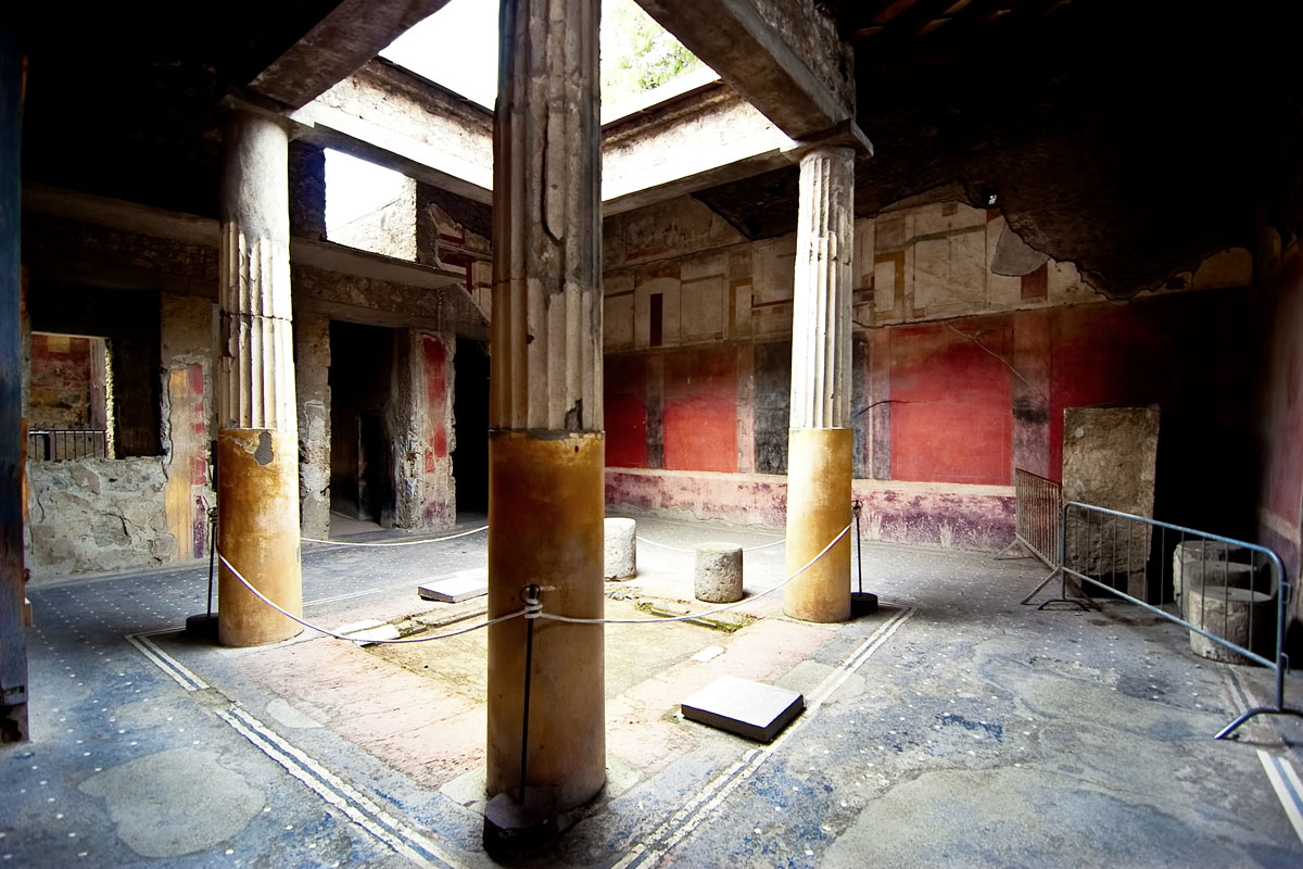
Nonetheless, there are certain perceptions and effects that apply to a majority of people: green, for instance, is generally associated with nature and therefore with relaxation. The ancient Romans also possessed this knowledge of colour theory and used it to great effect.
The Colours of Pompeii are underpinned by a similar approach. We create worlds of inspiration by exploring the origin of the colours. We work with each customer to find out which colours are their feel-good colours. It’s important, however, to place the effect of the colour in a specific context and try it out subjectively. At Colours of Pompeii, we therefore use unusually large colour charts in combination with digital tools, setting ourselves apart from other providers.
Colour Effect
The effect of colour must always be seen in context – and is often different from person to person. This is due to the experiences we have had with different colours, our history of perception and our culture. Blue, for example, may be soothing or stimulating, whereas red may either boost or inhibit creativity.
Nonetheless, there are certain perceptions and effects that apply to a majority of people: green, for instance, is generally associated with nature and therefore with relaxation. The ancient Romans also possessed this knowledge of colour theory and used it to great effect.
The Colours of Pompeii are underpinned by a similar approach. We create worlds of inspiration by exploring the origin of the colours. We work with each customer to find out which colours are their feel-good colours. It’s important, however, to place the effect of the colour in a specific context and try it out subjectively. At Colours of Pompeii, we therefore use unusually large colour charts in combination with digital tools, setting ourselves apart from other providers.
COLOUR PSYCHOLOGY
Can’t you just choose the colour that you like best? Of course you can! But there is a set of basic principles that underpins how most people perceive colour. And we recommend that you factor these principles into your decision. Ask yourself the following questions:
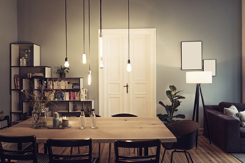
HOW DOES THE LIGHT FALL IN THE ROOM/ HOW DO YOU INTEND TO LIGHT THE ROOM?
Brightness in light and colour stimulates us, whereas darker colours and softer lighting are relaxing. We use light to influence the effect of colour. Bright light brings out lustre, whereas softer light lends colour a more calming effect. North-facing rooms get less sunlight than south-facing rooms. We recommend ‘warming up’ north-facing rooms with warm shades and employing cooler colours in south-facing rooms to strike a balance.
WHAT IS THE FUNCTION OF THE ROOM?
Ask yourself the following: how often am I here and what do I use the room for? How do you want to feel inside the room? Generally speaking: reds stimulate, blues soothe. Rich, vivid colours help you feel snug and cosy inside the room.
HOW BIG IS THE ROOM?
A simple trick for smaller rooms is that dark accent walls enlarge the sense of space. Nevertheless, brighter base colours generally make rooms seem larger, whereas darker colours make large rooms smaller – and therefore cosier.
HOW HIGH IS THE CEILING?
This is another impression that can be influenced. Ceilings painted in a light colour seem higher, whereas dark ceilings appear lower. It is always a good idea to create a colour contrast.
COLOUR PSYCHOLOGY
Can’t you just choose the colour that you like best? Of course you can! But there is a set of basic principles that underpins how most people perceive colour. And we recommend that you factor these principles into your decision. Ask yourself the following questions:
HOW DOES THE LIGHT FALL IN THE ROOM/ HOW DO YOU INTEND TO LIGHT THE ROOM?
Brightness in light and colour stimulates us, whereas darker colours and softer lighting are relaxing. We use light to influence the effect of colour. Bright light brings out lustre, whereas softer light lends colour a more calming effect. North-facing rooms get less sunlight than south-facing rooms. We recommend ‘warming up’ north-facing rooms with warm shades and employing cooler colours in south-facing rooms to strike a balance.
WHAT IS THE FUNCTION OF THE ROOM?
Ask yourself the following: how often am I here and what do I use the room for? How do you want to feel inside the room? Generally speaking: reds stimulate, blues soothe. Rich, vivid colours help you feel snug and cosy inside the room.
HOW BIG IS THE ROOM?
A simple trick for smaller rooms is that dark accent walls enlarge the sense of space. Nevertheless, brighter base colours generally make rooms seem larger, whereas darker colours make large rooms smaller – and therefore cosier.
HOW HIGH IS THE CEILING?
This is another impression that can be influenced. Ceilings painted in a light colour seem higher, whereas dark ceilings appear lower. It is always a good idea to create a colour contrast.
INSPIRATION AND IDEAS
HALL
Focus on bright, welcoming colours. The hall is often the first impression people get of your home. By selecting the right colours, you can ensure that guests not only feel at home, but that they can also be themselves. But remember: the hall is a place people pass through rather than linger, so feel free to be bold!
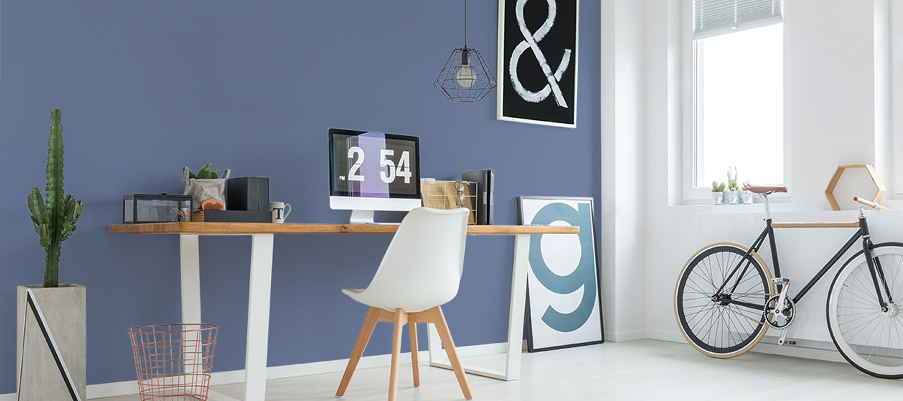
STUDY
Here, concentration is paramount. Here, we recommend the blue shade Ausonius, which is good at broadening intellectual horizons. Anyone looking for more inspiration is well served by the understated orange shade Decius, for example.
INSPIRATION AND IDEAS
HALL
Focus on bright, welcoming colours. The hall is often the first impression people get of your home. By selecting the right colours, you can ensure that guests not only feel at home, but that they can also be themselves. But remember: the hall is a place people pass through rather than linger, so feel free to be bold!
STUDY
Here, concentration is paramount. Here, we recommend the blue shade Ausonius, which is good at broadening intellectual horizons. Anyone looking for more inspiration is well served by the understated orange shade Decius, for example.
KITCHEN
The most important room of all. After all, the kitchen is the nerve centre of communication, especially when also used as a dining room. So it’s important to create a positive underlying ambience. Red stimulates, yellow spreads good cheer, orange combines both – so how about Julia, Lucia or Fulvia?
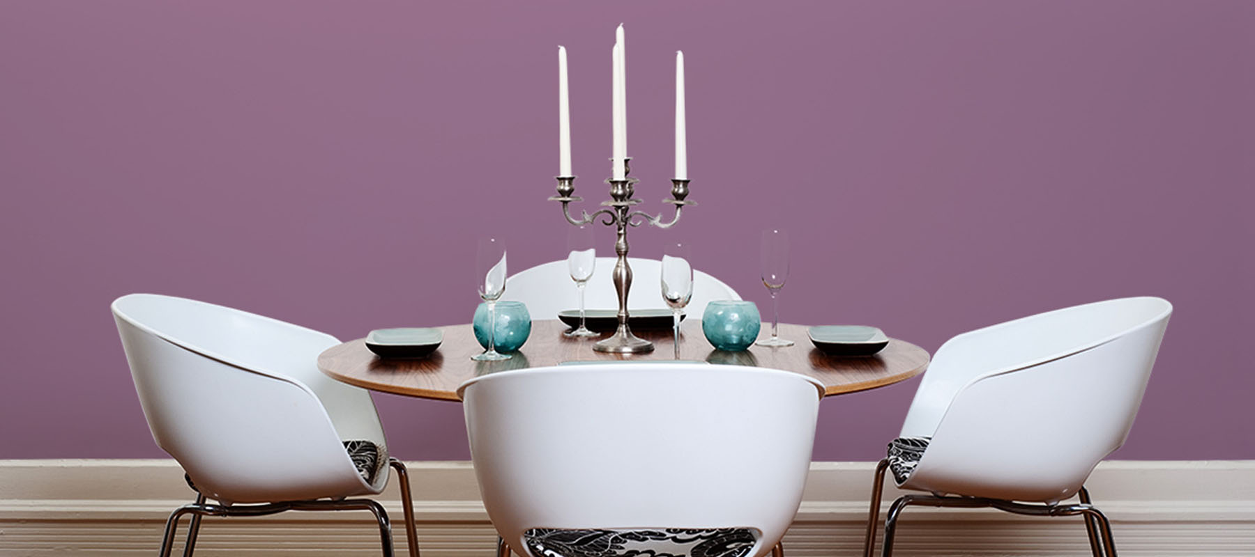
DINING ROOM/AREA
In homes with an open-plan dining area as part of the lounge, this can definitely be in a different colour to the rest of the room – as would be the case with a separate room. The question here is how you dine. Elegant and imposing or lively and casual? In the former case, we would recommend Octavius; in the latter case, Fabia.
KITCHEN
The most important room of all. After all, the kitchen is the nerve centre of communication, especially when also used as a dining room. So it’s important to create a positive underlying ambience. Red stimulates, yellow spreads good cheer, orange combines both – so how about Julia, Lucia or Fulvia?
DINING ROOM/AREA
In homes with an open-plan dining area as part of the lounge, this can definitely be in a different colour to the rest of the room – as would be the case with a separate room. The question here is how you dine. Elegant and imposing or lively and casual? In the former case, we would recommend Octavius; in the latter case, Fabia.
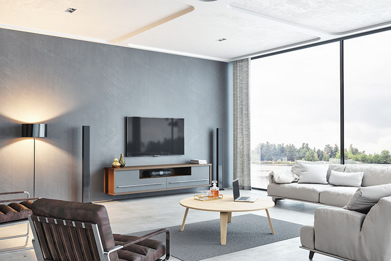
LIVING ROOM
This is usually the room in which people – residents and guests alike – spend the most time. This is an argument in favour of neutral, more understated colours with a calming effect. An effect that can be spiced up with the odd splash of colour.
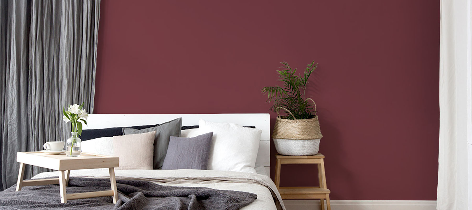
BEDROOM
This is the room to which you retire for the night, so select the colours that make you feel most comfortable. Avoid shades that are too stimulating, such as bright red. How about a dark, sophisticated purple like Tarquinius? Or a gentle gold tone such as Aurelia?
LIVING ROOM
This is usually the room in which people – residents and guests alike – spend the most time. This is an argument in favour of neutral, more understated colours with a calming effect. An effect that can be spiced up with the odd splash of colour.
BEDROOM
This is the room to which you retire for the night, so select the colours that make you feel most comfortable. Avoid shades that are too stimulating, such as bright red. How about a dark, sophisticated purple like Tarquinius? Or a gentle gold tone such as Aurelia?
Diedenhofener Straße 1
D-54294 Trier
bella-casa@mille-deco.com
Colours of Pompeii is a brand of premium wall paints. The range is inspired by the colours that one would once have seen on a stroll through Pompeii. Each colour is timeless and modern – and can be combined in a variety of ways.