AND COLOURS WITH THEIR OWN HISTORY.
THERE IS A HISTORY OF COLOURS.
AND COLOURS WITH THEIR OWN HISTORY.
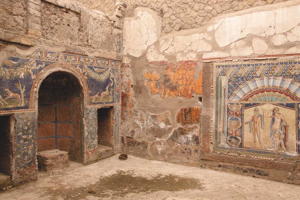
INSPIRED BY THE ANCIENT WORLD
CREATED FOR THE FUTURE
THE BRAND
Colours of Pompeii will mean
more than paint »feeling well
more than a coat » feeling healthy
THE BRAND
Colours of Pompeii will mean
more than paint »feeling well
more than a coat » feeling healthy
back to nature
back to the roots
future oriented sustainability
100 % paint biological
100% natürliche Rohstoffe
100% regrowing raw materials
absolutely free of harmfully substances
also free of preservatives
0 gr VOC/ltr.
especially childfriendly
low odour
agreeable application
high yield (14 m²/ ltr.)
professionell class of coverage N° 1
class of wet abrasion N° 1
high effect of depth
super mat
great haptics
100 % paint biological

100% natürliche Rohstoffe
100% regrowing raw materials
absolutely free of harmfully substances
also free of preservatives
0 gr VOC/ltr.
especially childfriendly
low odour
agreeable application
high yield (14 m²/ ltr.)
professionell class of coverage N° 1
class of wet abrasion N° 1
high effect of depth
super mat
great haptics
COLOUR EFFECT
OUR CONCEPT
Antiquity paired with modernity
MODERN YET TIMELESS
GENUINE ORIGIN
CLEAR NATURALNESS
DISTINCTIVE CHARACTER
INCREDIBLE BEAUTY
STRONG EFFECT IN DEPTH
PASTEL COLOUR
TRADITIONEL ACCENTS
COLOUR EFFECT
OUR CONCEPT
antiquity paired with modernity
»
THE COLOURS FOR COLOURS OF POMPEII
THE COLOURS FOR COLOURS OF POMPEII
Pompeii was colourful, vibrant and divers. From the ancient city`s entire colour spectrum, we have identified 40 differnet hues that are ideal for both painting walls in block colours and for adding splashes of colour here and there.
THE COLOURS FOR COLOURS OF POMPEII
THE COLOURS FOR COLOURS OF POMPEII
Pompeii was colourful, vibrant and divers. From the ancient city`s entire colour spectrum, we have identified 40 differnet hues that are ideal for both painting walls in block colours and for adding splashes of colour here and there.
OSSIDATO
OSSDIATO
OSSIDATO
OSSIDATO
BEIGE
BEIGE
AZ I
VO I
GO I
RO I
IB I
NO I
MB I
GB I
AZ II
VO II
GO II
RO II
IB II
NO II
MB II
GB II
AZ IV
VO IV
GO IV
RO IV
IB IV
NO IV
MB IV
GB IV
AZ V
VO V
GO V
RO V
IB v
NO V
MB V
GB V
Farbfamilien
Farbfamilien
IN THE MODERN AGE:
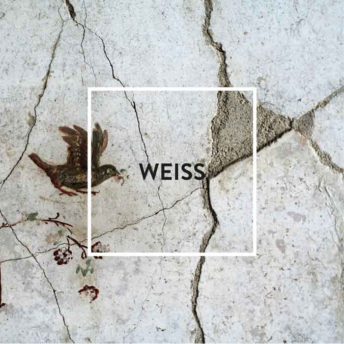
White – especially one that has been toned down a touch – is perfect when it comes to setting the stage and helping other colours make a big impression. That’s because the contrast to white lets them shine in all their glory, such as when used as a contrasting wall.
I BIANCI | IB
WHITE

IN POMPEJI:
Even in colourful Pompeii, white was frequently used as a base colour. But even back then, there were big differences in the quality of the white paints available. The most expensive variety was imported by sea from Egypt, an arduous process that, of course, was reflected in its price. Anyone who was not prepared to forgo the high quality of Egyptian paint had to spend more than 30 times as much as someone who was satisfied with the cheapest product.
IN THE HOME:
Only at first glance bright white walls appear simple and reserved. The truth is that we are exposed to an overstimulation by white walls. Our pupils narrow because of the brightness, objects within the room are less perceived by us. Especially in rooms facing north, white often feels cold and uncomfortable, which is why warmer tones are better here.
IN THE MODERN AGE:
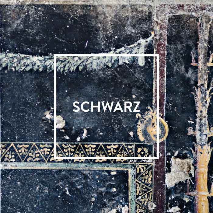
Black is the classic choice when it comes to making something appear elegant and sophisticated. That’s why many luxury items rely on the dependability offered by black. Understated luxury goes hand in hand with black. Black, especially in a matt finish, remains a firm favourite in the luxury segment.
BLACK

IN POMPEJI:
The next step up from grey is black. Black has been popular with artists for a very long time. Appelles is regarded by many as the finest painter in antiquity – and is admired for his mastery of the colour black. With infallible flair, he painted walls solely in the colours of black, yellow, red and white. And he was such a master of his craft that debate even raged about whether other colours should be used at all.
IN THE HOME:
Black creates sharp contrasts in a room, similar to those witnessed in black-and-white photography. In other words, it influences how we perceive a room. The lighter areas of the room are highlighted, whereas the darker ones withdraw into the background. This comes in handy whenever you want to ‘conceal’ something. In relation to a black wall, experts refer to ‘off-black’ – a tone that is often used as an artistic stage.
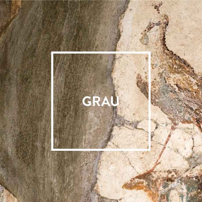
IN THE MODERN AGE:
Grey is generally regarded as highly sophisticated, with grey suits seen as a sartorially elegant choice for men and women alike. When combined with an accent colour, grey can convey a vibrant elegance.
GREY

IN POMPEJI:
Grey struggles to shake off its reputation for being boring. When they hear the word ‘grey’, many people think of concrete. But that’s not fair! After all, this is a colour that comes straight from nature. Its wide variety of shades reflects the myriad colours of the stones and rock faces found in forests, mountains and by the sea – and these could hardly be more diverse. Grey was also found in Pompeii, where it was brightened up with accent colours.
IN THE HOME:
When deployed skilfully, grey can guide attention within a living space. Grey walls and ceilings are understated – and the ideal stage for colour harmony. Furniture and other items appear particularly refined against a grey background. When grey is mixed with bright accent colours, the result is upbeat and vibrant. But it’s all about the right dose. To stop grey from seeming too monotonous, we recommend splashes of colour in black and white.
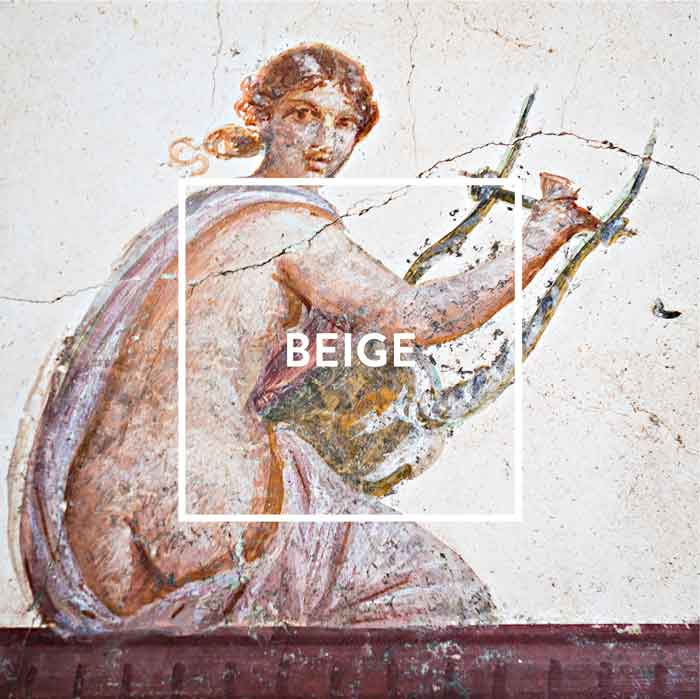
IN THE MODERN AGE:
Nowadays, beige tones are associated with understated elegance. Michelle Obama wore beige for her first state visit as First Lady – and was dressed impeccably.
BEIGE

IN POMPEJI:
The name ‘beige’ is derived from the Roman province of Baetica, an area which roughly corresponds to present-day Andalusia. Baetica was famed for its wool, which was beige in colour before being bleached. Whereas clothing in this natural colour was generally viewed as a sign of a humble existence in ancient Rome, beige garments are now synonymous with the utmost sophistication. In antiquity, a special mixing and painting technique was required to apply this colour to a wall, with some painters famed for their mastery of this technique. As beige shades are also found in the form of natural stone, we encounter them as frequently in the streets of Pompeii as in modern-day apartments in Paris and New York.
IN THE HOME:
Beige tones exude a natural, cosy atmosphere. They bring warmth and comfort into a room, although the effects are always slightly different. After all, the palette ranges from the wall colour cream through to pastel shades, as well as sandy and earthy hues. In other words, not all beiges are alike. Beige is also ideal for balancing out a combination of rich colours in the same room, such as green, yellow and red.
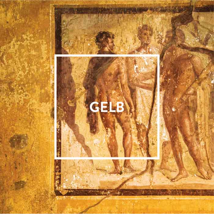
IN THE MODERN AGE:
Yellow is a symbol of life, as witnessed every spring. Yellow is the colour of positivity and cheerfulness – and makes people happy. It is the colour with the most powerful long-distance effect and has always been used for anything that has to stand out from afar. In Asia, yellow has always stood for all things divine and holy – and for beauty in general.
YELLOW

IN POMPEJI:
Even in Pompeii, the positive effect of yellow was widely known. The ancient Romans added a special coating to light yellow to maximise its lustre. As an alternative, they also used gold-coloured orpiment, which even dazzles in low light. Its lavish walls were one of the reasons why Nero’s palace was named the ‘Golden House’; the emperor himself, who adored the fine arts more than any other Roman ruler, was all too delighted to be portrayed as the sun god.
IN THE HOME:
More than any other colour, yellow benefits from light. Its effect changes all the time, depending on how sunlight falls. Yellow increases attentiveness, gives us energy and calms our fears. Yellow makes us happy! It is the ideal colour for lounges and dining rooms, as it creates a positive atmosphere for stimulating conversations. Yellow tones are also just the thing for foyers, hallways and kitchens.
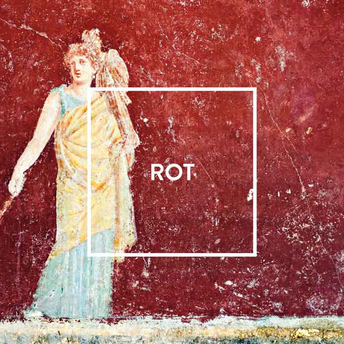
IN THE MODERN AGE:
Red has a unique effect on people and their behaviour. The allure of a woman dressed all in red is neither a coincidence nor a cliché. Red is a classic signal colour. It symbolises love and happiness, romance and passion; in China, it is also associated with wealth and prosperity.
REDS

IN POMPEJI:
Purple was the ultimate symbol of power in the Roman Empire. In the first century . B.C., Pliny the Elder wrote: ‘it is this exquisite colour, which flirts with the spectrum of dark reds and pinks, that distinguishes a senator from a knight.’ An official’s rank was indicated by the width of the purple stripes on their garments. However, only the emperor himself was permitted to dress all in red. In late antiquity, draconian punishments were imposed for the unauthorised possession of purple (i.e. imperial) fabrics.
IN THE HOME:
It’s all about the tone. When used as an accent colour, red sends a signal, makes a point and sets the stage for design highlights. When toned down using brown, red feels cosy, exudes warmth and promotes well-being within the room – like the comfort of the fireside. Colour psychologists recommend that red should chiefly be used as an accent colour. Rooms painted completely in red are a rarity. In a bedroom, for instance, it would be hard to get a good night’s sleep, as red is far too stimulating. A dark, vivid red by the fireplace, on the other hand, is invigorating and warm.
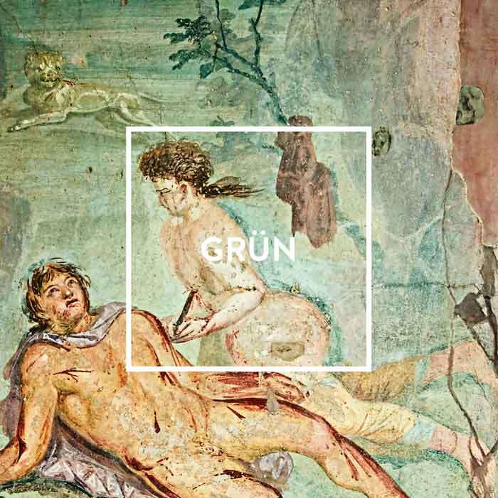
IN THE MODERN AGE:
Green is generally associated with nature; it symbolises paradise and eternal youth. It reminds us of the forest, as well as meadows and spring. Green is the colour of hope – not just empty words, but a fact rooted in history. Is that why George Washington chose such an unusual and elegant shade of green for his parlour?
GREEN

IN POMPEJI:
When it comes to green, the people of Pompeii got off to a slow start; whereas the Egyptians and the Etruscans used the colour at an early stage to decorate their walls, it only came into favour relatively late in Pompeii. But was soon all the rage: once the colour had established itself, there were more than ten different shades of green on the market in Pompeii.
IN THE HOME:
Because green has a balancing function, it can be used in any room. It is reassuringly natural – and soothing yet stimulating. It calms us and helps us to control our mood swings. When used in living spaces, green creates a refuge that counteracts the greys, blacks and browns that are so dominant in big cities. Here, green performs a psychologically important function that should not be underestimated.
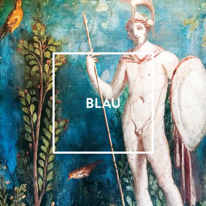
IN THE MODERN AGE:
Blue is generally associated with calm, reliability and loyalty (‘true blue’), which is one of the reasons why it is so popular in the professional and political worlds. At the swearing-in ceremony of Germany’s government ministers in March 2018, three female ministers wore outfits in resplendent blue (two of which were virtually identical, although this was unplanned). Globally, blue is by far the most popular colour.
BLUE

IN POMPEJI:
Blue was imported to Pompeii from Egypt. In keeping with its origins, it was originally called ‘Egyptian blue’, but was later known as ‘Pompeian blue’. It was an absolute luxury – and had been used to decorate walls in ancient Egypt since at least 2,500 B.C. Even then, prices were determined by supply and demand; in Pompeii, blue was so highly sought after that its price sometimes even surpassed that of the astronomically expensive purple.
IN THE HOME:
Blue comes across as calm, sober and reserved. It’s the cool big sister of dominant red. Blue is content to be in the background. It makes rooms seem larger and more expansive than they really are. It guides the viewer’s gaze into the distance, thus creating a sense of infinity. It’s a colour that soothes, creates a certain openness and thus nurtures creativity. It reminds us of the sky and sea and makes some of us feel a little melancholy; otherwise, Pablo Picasso would probably never have had a Blue Period. Entire rooms can be painted in lighter shades of blue; the richer the blue, the more it lends itself to subtle colour touches.

I BIANCI | IB
WHITE

IN THE MODERN AGE:
White – especially one that has been toned down a touch – is perfect when it comes to setting the stage and helping other colours make a big impression. That’s because the contrast to white lets them shine in all their glory, such as when used as a contrasting wall.
IN POMPEJI:
Even in colourful Pompeii, white was frequently used as a base colour. But even back then, there were big differences in the quality of the white paints available. The most expensive variety was imported by sea from Egypt, an arduous process that, of course, was reflected in its price. Anyone who was not prepared to forgo the high quality of Egyptian paint had to spend more than 30 times as much as someone who was satisfied with the cheapest product.
IN DER WOHNUNG:
Only at first glance bright white walls appear simple and reserved. The truth is that we are exposed to an overstimulation by white walls. Our pupils narrow because of the brightness, objects within the room are less perceived by us. Especially in rooms facing north, white often feels cold and uncomfortable, which is why warmer tones are better here.

BLACK

IN THE MODERN AGE:
Black is the classic choice when it comes to making something appear elegant and sophisticated. That’s why many luxury items rely on the dependability offered by black. Understated luxury goes hand in hand with black. Black, especially in a matt finish, remains a firm favourite in the luxury segment.
IN POMPEJI:
The next step up from grey is black. Black has been popular with artists for a very long time. Appelles is regarded by many as the finest painter in antiquity – and is admired for his mastery of the colour black. With infallible flair, he painted walls solely in the colours of black, yellow, red and white. And he was such a master of his craft that debate even raged about whether other colours should be used at all.
IN THE HOME:
Black creates sharp contrasts in a room, similar to those witnessed in black-and-white photography. In other words, it influences how we perceive a room. The lighter areas of the room are highlighted, whereas the darker ones withdraw into the background. This comes in handy whenever you want to ‘conceal’ something. In relation to a black wall, experts refer to ‘off-black’ – a tone that is often used as an artistic stage.

GREY

IN THE MODERN AGE:
Grey is generally regarded as highly sophisticated, with grey suits seen as a sartorially elegant choice for men and women alike. When combined with an accent colour, grey can convey a vibrant elegance.
IN POMPEJI:
Grey struggles to shake off its reputation for being boring. When they hear the word ‘grey’, many people think of concrete. But that’s not fair! After all, this is a colour that comes straight from nature. Its wide variety of shades reflects the myriad colours of the stones and rock faces found in forests, mountains and by the sea – and these could hardly be more diverse. Grey was also found in Pompeii, where it was brightened up with accent colours.
IN THE HOME:
When deployed skilfully, grey can guide attention within a living space. Grey walls and ceilings are understated – and the ideal stage for colour harmony. Furniture and other items appear particularly refined against a grey background. When grey is mixed with bright accent colours, the result is upbeat and vibrant. But it’s all about the right dose. To stop grey from seeming too monotonous, we recommend splashes of colour in black and white.

BEIGE

IN THE MODERN AGE:
Nowadays, beige tones are associated with understated elegance. Michelle Obama wore beige for her first state visit as First Lady – and was dressed impeccably.
IN POMPEJI:
The name ‘beige’ is derived from the Roman province of Baetica, an area which roughly corresponds to present-day Andalusia. Baetica was famed for its wool, which was beige in colour before being bleached. Whereas clothing in this natural colour was generally viewed as a sign of a humble existence in ancient Rome, beige garments are now synonymous with the utmost sophistication. In antiquity, a special mixing and painting technique was required to apply this colour to a wall, with some painters famed for their mastery of this technique. As beige shades are also found in the form of natural stone, we encounter them as frequently in the streets of Pompeii as in modern-day apartments in Paris and New York.
IN THE HOME:
Beige tones exude a natural, cosy atmosphere. They bring warmth and comfort into a room, although the effects are always slightly different. After all, the palette ranges from the wall colour cream through to pastel shades, as well as sandy and earthy hues. In other words, not all beiges are alike. Beige is also ideal for balancing out a combination of rich colours in the same room, such as green, yellow and red.

YELLOW

IN THE MODERN AGE:
Yellow is a symbol of life, as witnessed every spring. Yellow is the colour of positivity and cheerfulness – and makes people happy. It is the colour with the most powerful long-distance effect and has always been used for anything that has to stand out from afar. In Asia, yellow has always stood for all things divine and holy – and for beauty in general.
IN POMPEJI:
Even in Pompeii, the positive effect of yellow was widely known. The ancient Romans added a special coating to light yellow to maximise its lustre. As an alternative, they also used gold-coloured orpiment, which even dazzles in low light. Its lavish walls were one of the reasons why Nero’s palace was named the ‘Golden House’; the emperor himself, who adored the fine arts more than any other Roman ruler, was all too delighted to be portrayed as the sun god.
IN THE HOME:
More than any other colour, yellow benefits from light. Its effect changes all the time, depending on how sunlight falls. Yellow increases attentiveness, gives us energy and calms our fears. Yellow makes us happy! It is the ideal colour for lounges and dining rooms, as it creates a positive atmosphere for stimulating conversations. Yellow tones are also just the thing for foyers, hallways and kitchens.

REDS

IN THE MODERN AGE:
Red has a unique effect on people and their behaviour. The allure of a woman dressed all in red is neither a coincidence nor a cliché. Red is a classic signal colour. It symbolises love and happiness, romance and passion; in China, it is also associated with wealth and prosperity.
IN POMPEJI:
Purple was the ultimate symbol of power in the Roman Empire. In the first century . B.C., Pliny the Elder wrote: ‘it is this exquisite colour, which flirts with the spectrum of dark reds and pinks, that distinguishes a senator from a knight.’ An official’s rank was indicated by the width of the purple stripes on their garments. However, only the emperor himself was permitted to dress all in red. In late antiquity, draconian punishments were imposed for the unauthorised possession of purple (i.e. imperial) fabrics.
IN THE HOME:
It’s all about the tone. When used as an accent colour, red sends a signal, makes a point and sets the stage for design highlights. When toned down using brown, red feels cosy, exudes warmth and promotes well-being within the room – like the comfort of the fireside. Colour psychologists recommend that red should chiefly be used as an accent colour. Rooms painted completely in red are a rarity. In a bedroom, for instance, it would be hard to get a good night’s sleep, as red is far too stimulating. A dark, vivid red by the fireplace, on the other hand, is invigorating and warm.

GREEN

IN THE MODERN AGE:
Green is generally associated with nature; it symbolises paradise and eternal youth. It reminds us of the forest, as well as meadows and spring. Green is the colour of hope – not just empty words, but a fact rooted in history. Is that why George Washington chose such an unusual and elegant shade of green for his parlour?
IN POMPEJI:
When it comes to green, the people of Pompeii got off to a slow start; whereas the Egyptians and the Etruscans used the colour at an early stage to decorate their walls, it only came into favour relatively late in Pompeii. But was soon all the rage: once the colour had established itself, there were more than ten different shades of green on the market in Pompeii.
IN THE HOME:
Because green has a balancing function, it can be used in any room. It is reassuringly natural – and soothing yet stimulating. It calms us and helps us to control our mood swings. When used in living spaces, green creates a refuge that counteracts the greys, blacks and browns that are so dominant in big cities. Here, green performs a psychologically important function that should not be underestimated.

BLUE

IN THE MODERN AGE:
Blue is generally associated with calm, reliability and loyalty (‘true blue’), which is one of the reasons why it is so popular in the professional and political worlds. At the swearing-in ceremony of Germany’s government ministers in March 2018, three female ministers wore outfits in resplendent blue (two of which were virtually identical, although this was unplanned). Globally, blue is by far the most popular colour.
IN POMPEJI:
Blue was imported to Pompeii from Egypt. In keeping with its origins, it was originally called ‘Egyptian blue’, but was later known as ‘Pompeian blue’. It was an absolute luxury – and had been used to decorate walls in ancient Egypt since at least 2,500 B.C. Even then, prices were determined by supply and demand; in Pompeii, blue was so highly sought after that its price sometimes even surpassed that of the astronomically expensive purple.
IN THE HOME:
Blue comes across as calm, sober and reserved. It’s the cool big sister of dominant red. Blue is content to be in the background. It makes rooms seem larger and more expansive than they really are. It guides the viewer’s gaze into the distance, thus creating a sense of infinity. It’s a colour that soothes, creates a certain openness and thus nurtures creativity. It reminds us of the sky and sea and makes some of us feel a little melancholy; otherwise, Pablo Picasso would probably never have had a Blue Period. Entire rooms can be painted in lighter shades of blue; the richer the blue, the more it lends itself to subtle colour touches.
Order form
Wir freuen uns über Ihr Interesse an unseren Farben. Mit dem nachfolgendem Formular können Sie alle Farbtöne aus unserem Sortiment bestellen.
Zahlungs- und Lieferbedingungen
Lieferbedingungen bzw -kosten:
Versand per Kurier: 8,00€ / Paket
Frachtfrei ab Warenwert von 300,00€
INTERESSE GEWECKT?
Zögern Sie nicht uns bei Fragen und Anregungen zu kontaktieren. Wir haben ebenso Kataloge, Broschüren sowie Aufsteller zum Bestellen für Sie bereitstehen.
Sie erreichen uns telefonisch und via E-Mail unter:
+49 651/9989420bella-casa@mille-deco.com
Order form
Wir freuen uns über Ihr Interesse an unseren Farben. Mit dem nachfolgendem Formular können Sie alle Farbtöne aus unserem Sortiment bestellen.
Zahlungs- und Lieferbedingungen
Lieferbedingungen bzw -kosten:
Versand per Kurier: 8,00€ / Paket
Frachtfrei ab Warenwert von 300,00€
Interesse geweckt?
Zögern Sie nicht uns bei Fragen und Anregungen zu kontaktieren. Wir haben ebenso Kataloge, Broschüren sowie Aufsteller zum Bestellen für Sie bereitstehen.
Sie erreichen uns telefonisch und via E-Mail unter:
+49 651/9989420
Diedenhofener Straße 1
D-54294 Trier
bella-casa@mille-deco.com
Colours of Pompeii is a brand of premium wall paints. The range is inspired by the colours that one would once have seen on a stroll through Pompeii. Each colour is timeless and modern – and can be combined in a variety of ways.
